World Food Programme
Food for Thought: a new fundraising model.
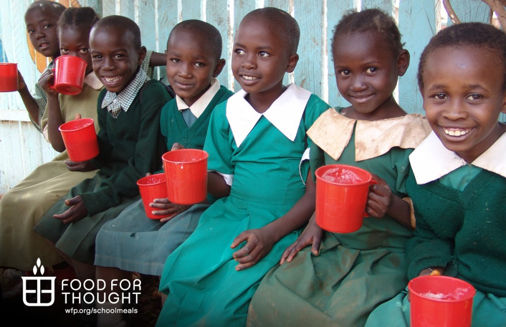

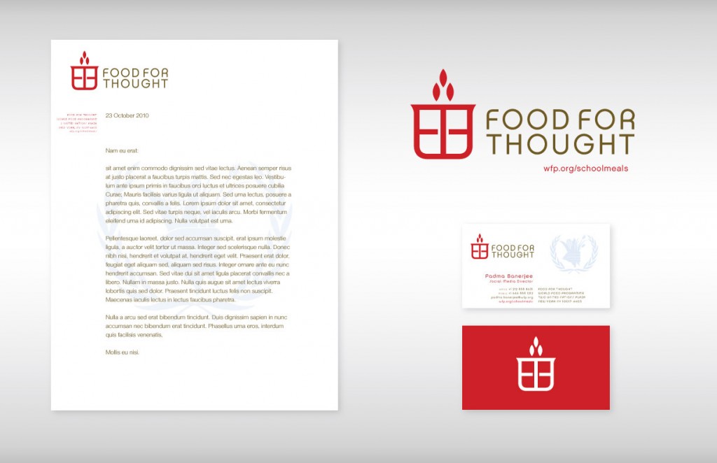
Working for David Clark Cause, our assignment was to create a logo to brand a new World Food Programme (WFP) initiative, leveraging the relationship between nutrition and successful learning in the developing world.
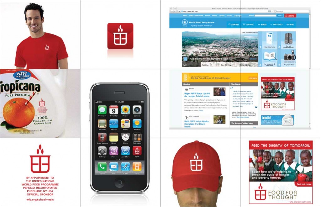
This “Food for Thought” brand/logo would be licensed to corporations to use on their products and services and solicit donations and support for the WFP’s school feeding program, thereby introducing a B-to-C component to existing foundation contributions.
Before & After
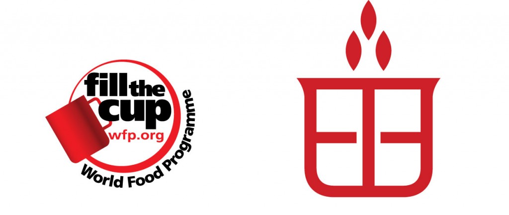
Food for Thought is intended to pull together several existing yet disparate WFP initiatives under one powerful brand. The logo builds upon an existing red “fill the cup” heritage, using a stylized “cup” shape and embedding FFT into the center of the red logo
Symbolism
This abstract cup is a sigil made with the F’s in “Food” and “For” and the T in “Thought”
The shape is unique and has the potential to become iconic
It has badge value, with the lip of the cup resembling the corners of a shield
The plus sign is only suggested; when your mind completes it, the logo becomes more memorable
The three elements on top can be interpreted as either going in or emerging
GOING IN
They could be wheat or rice
EMERGING
They symbolize opportunity rising from the cup,
a light or flame, as in the Lamp of Knowledge
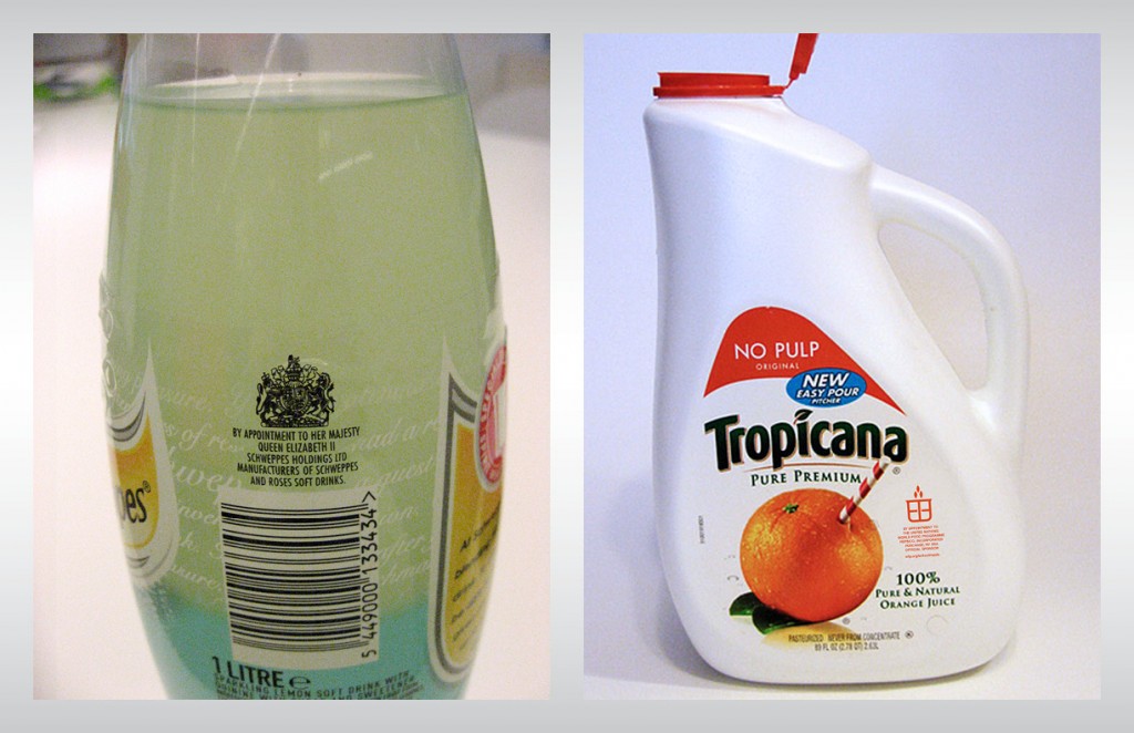
Warrants
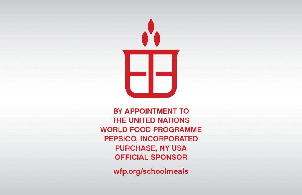
Inspired by Royal Warrants placed on authorized products endorsed by a Queen or King, FFT warrants are given to each licensed partner for application to their product or packaging, alerting customers of their official WFP status and assuring that purchase of the product contributes to the World Food Programme.


Branding Applications
Stationery