
BRIC POP
A reference manual for global “cool”
A reference manual for global “cool”
BRIC POP by Richard Monturo “reverses conventional thinking to show how America and Europe are already losing their creative ‘cool’ to the BRICs, and may wind up outsourcing more than just low-cost jobs.”
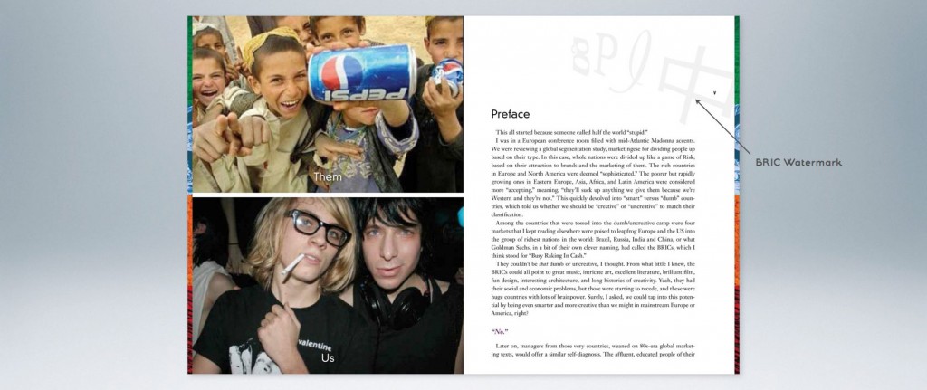
The creation of this publication launched BRIC POP as a brand. Motherhaus designed the logo, edited the photos and laid out the entire book in keeping with Richard’s vision. Geared to creative and marketing-oriented audiences, BRIC POP had to be easily accessible as a reference manual, so we incorporated a text and graphic coding system into the design.
About this Project
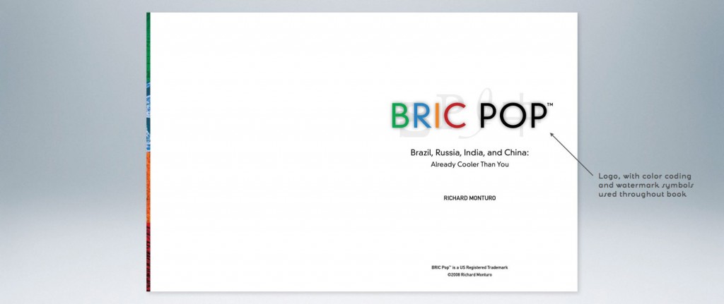
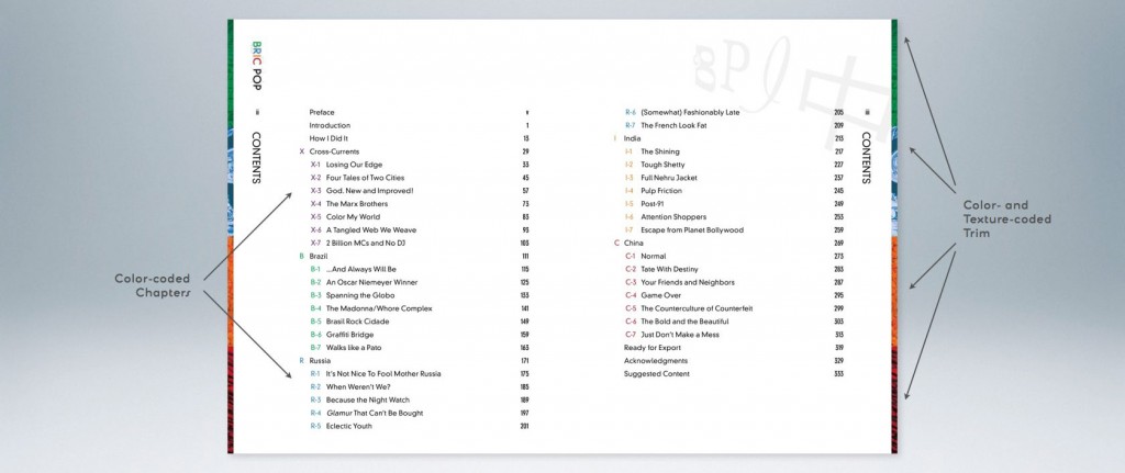
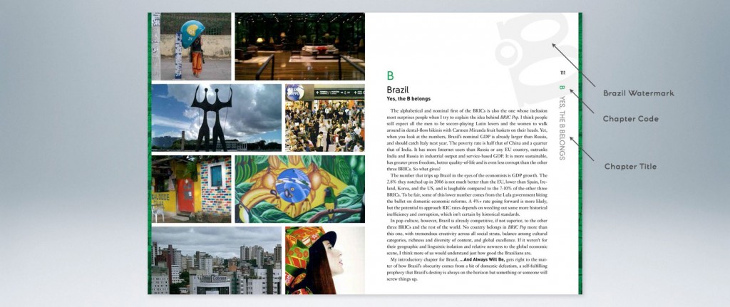
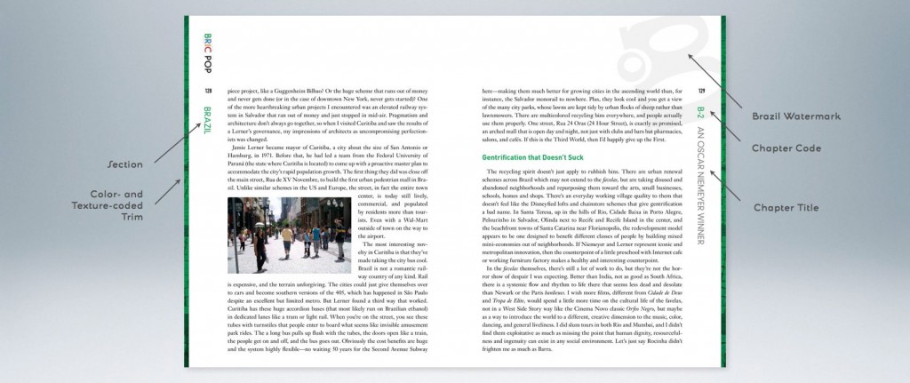
Colors
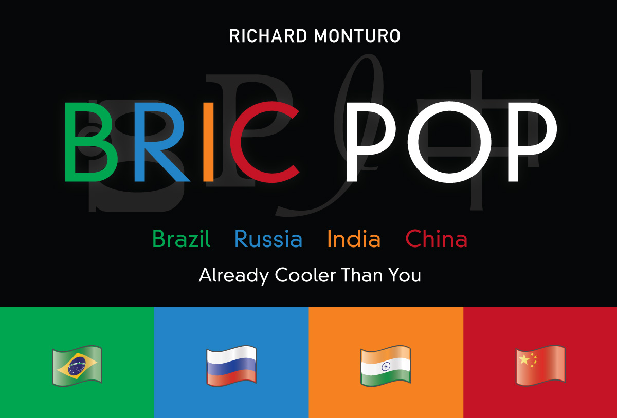
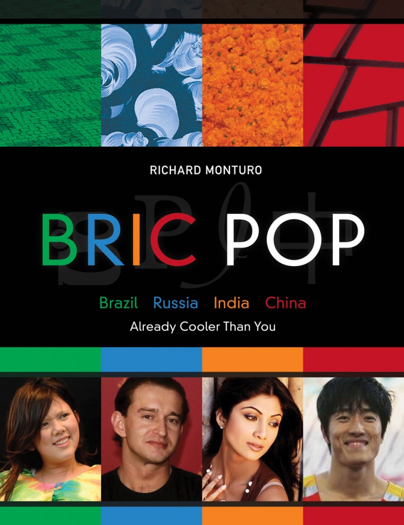
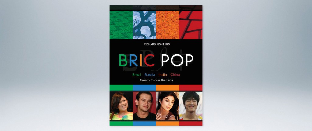
The BRIC POP logo encapsulates many of the design elements used throughout the book. For instance, the colors of the letters establish the color-coding system and align with the country represented:
Brazil is Green — Russia is Blue — India is Saffron — China is Red
Textures
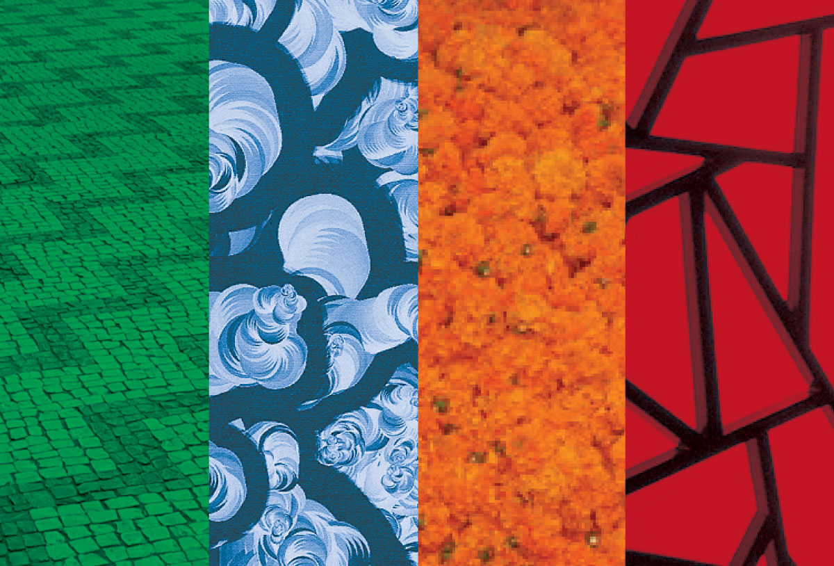
There are four representative textures used throughout the book as page trim to call-out each country’s section at a glance. We sampled from references Richard pulled together during his research tours:
Brazil’s iconic sidewalk patterns
Russia’s contemporary art scene
India’s prolific flower markets
China’s ubiquitous woodworking
Fonts
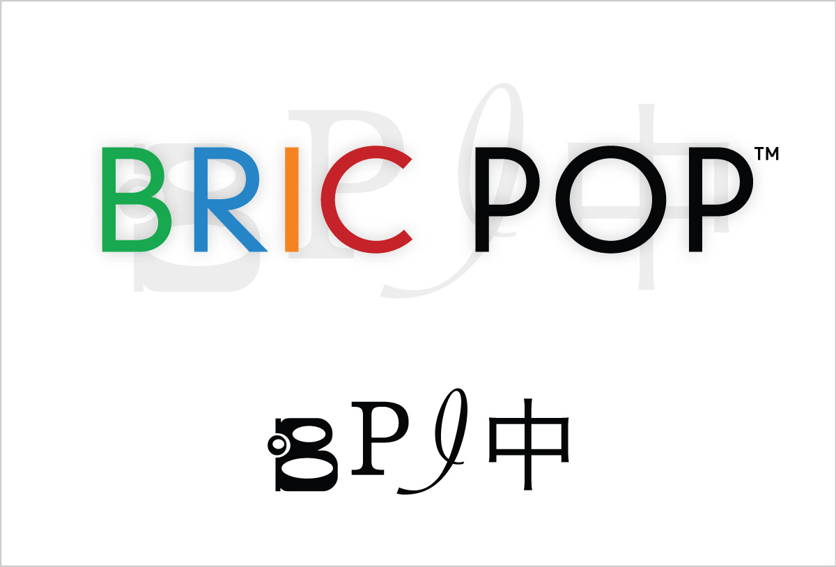
The primary typeface is DIN Neuzeit Grotesk Light, used for the BRIC POP name and for headings. We needed a font that was clean and neutral to avoid any implication of preference for a particular country or culture.
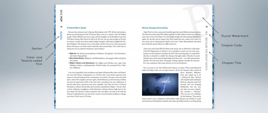
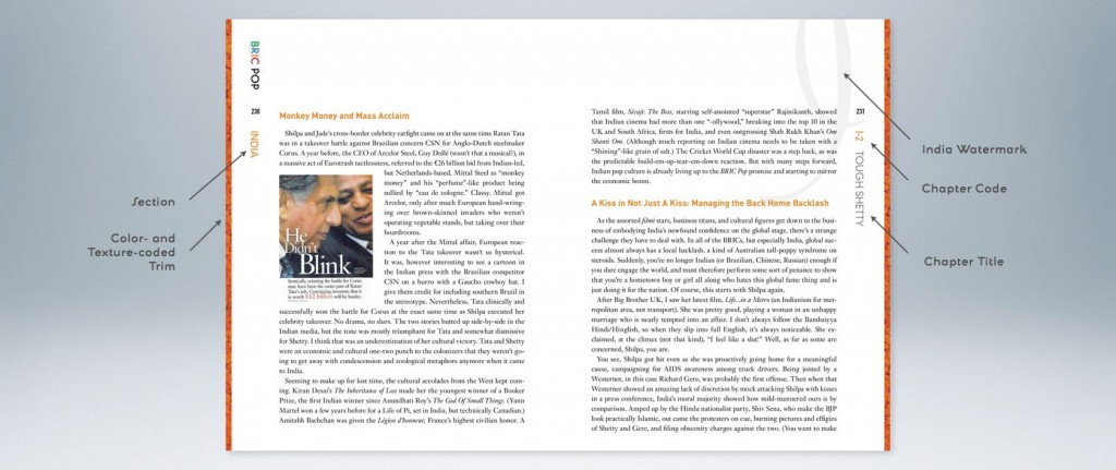
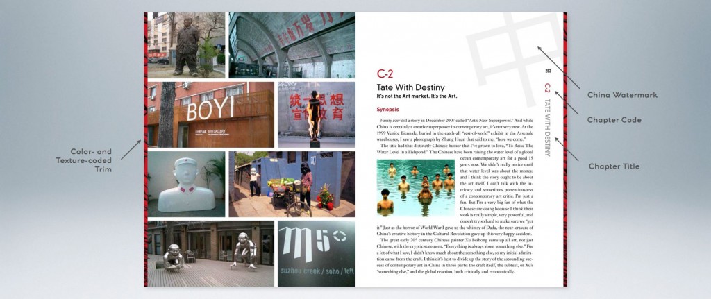
We did, however, place stylized letters behind the name in order to bring in some personality reflective of each of the BRICs. They are used individually throughout the book as watermarks tied to each country’s section.
Brazil: A funky pop-art “B”
Russia: A cyrillic “R”
India: a curvacious “I”
(we considered using a Sanskrit letter, but it seemed potentially divisive)
China: the hanzi for “China”
For the body copy we chose Janson Text, a seventeenth-century font that has seen a contemporary resurgence.