BUILDING A BRAND
A foundation in fashion
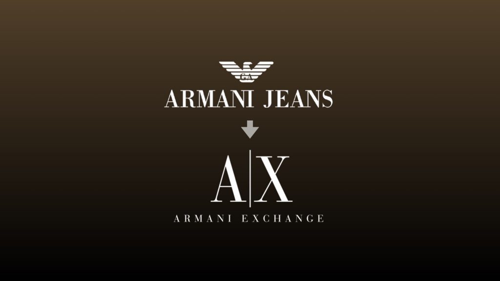
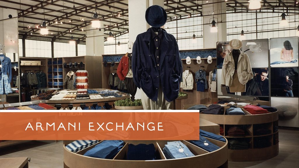
After my own transition in career path, some amazing doors opened up in the fashion world. My first experience in branding was working in-house with Giorgio Armani, as part of the store design team. We were responsible for rebranding Armani Jeans for a transition into the American market, building a new brand concept: A/X Armani Exchange.
During those four years, I was mentored by some of the top creative talent in the world, and had a hand in every aspect of this award-winning brand concept. I learned to insist on excellence and to pay attention to every detail. Most importantly, I learned to bridge worlds: to mix science and art, research and inspiration, left and right brain thinking, building an elegant world of synchronized elements that tell a compelling story.
See Case StudyBRAND WITH PURPOSE
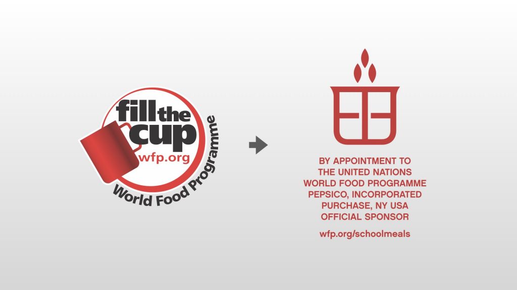
Fundraising by “Royal Warrant”
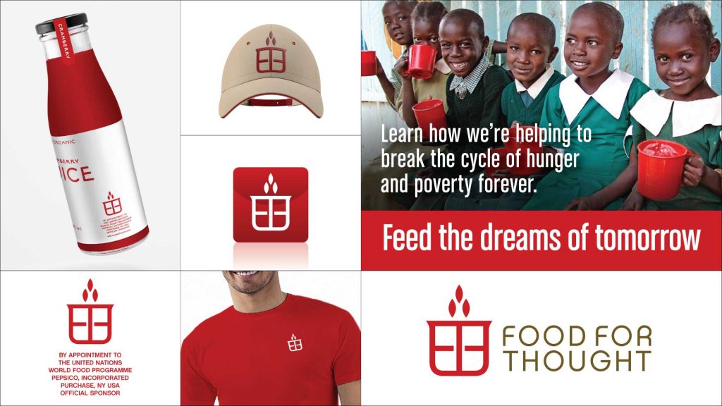
I also spent some time as creative director with two international ad agencies. When I was with J Walter Thompson, I got to work on my first purpose-driven project, rebranding the United Nations World Food Programme.
Using a “royal warrant” concept—think of the seals bearing “By Appointment to Her Majesty…” you’ll find on products—the new Food For Thought program presented a revolutionary new way for brands to unite with their customers in support of in-school feeding programs. The new updated identity was embedded with meaning, while still referencing the Red Cup, the symbol of the program.
See Case StudyBridging Worlds
Adding Meaning to a Fashion Launch
To illustrate the merging marketing and meaning, I’m going to walk you through a case study, showing how we launched a European fashion brand in the US when that country was displaying ridiculous levels of xenophobia. This was the ‘freedom fries” era, when the right wing of America was sending a lot of hate towards Europe.
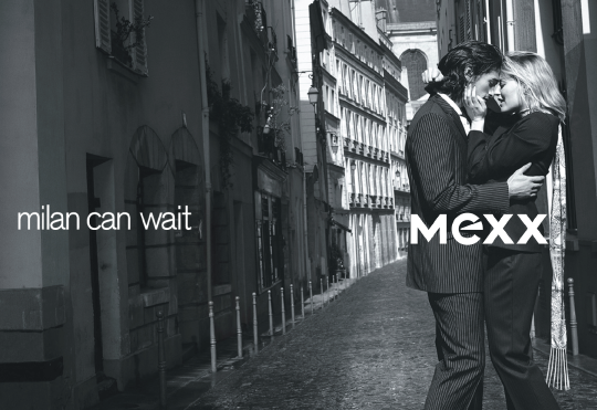
This is the ad concept the Mexx was originally going to use for the US launch. While it was fine for European markets where the name was already well established, we felt the campaign felt flat and wouldn’t connect with a brand new audience.
We wanted to find a way to have more impact, in a meaningful way, so we went into the history of Mexx, named after the merging of two fashion labels, Moustache and Emanuelle, brought together with two kisses. M-E-X-X
The kiss has always been core to the Dutch brand and the attitude was always optimistic, inspiring, fun, and non-conforming.
For graphic elements, we identified two symbols for the kiss: an X and a lip print.
Since the campaign was to launch in the fall, autumnal tones were introduced, bringing in orange, the color of Mexx’s home country of the Netherlands.
LAUNCH TIME
To launch the campaign, we blanketed Manhattan with street banners showing the Statue of Liberty bearing two kiss prints and “Kisses NYC” on one side and “kisses” translated into European languages on the other side, sending greetings of love from Europe to New York, just as a 9-11 anniversary was happening.
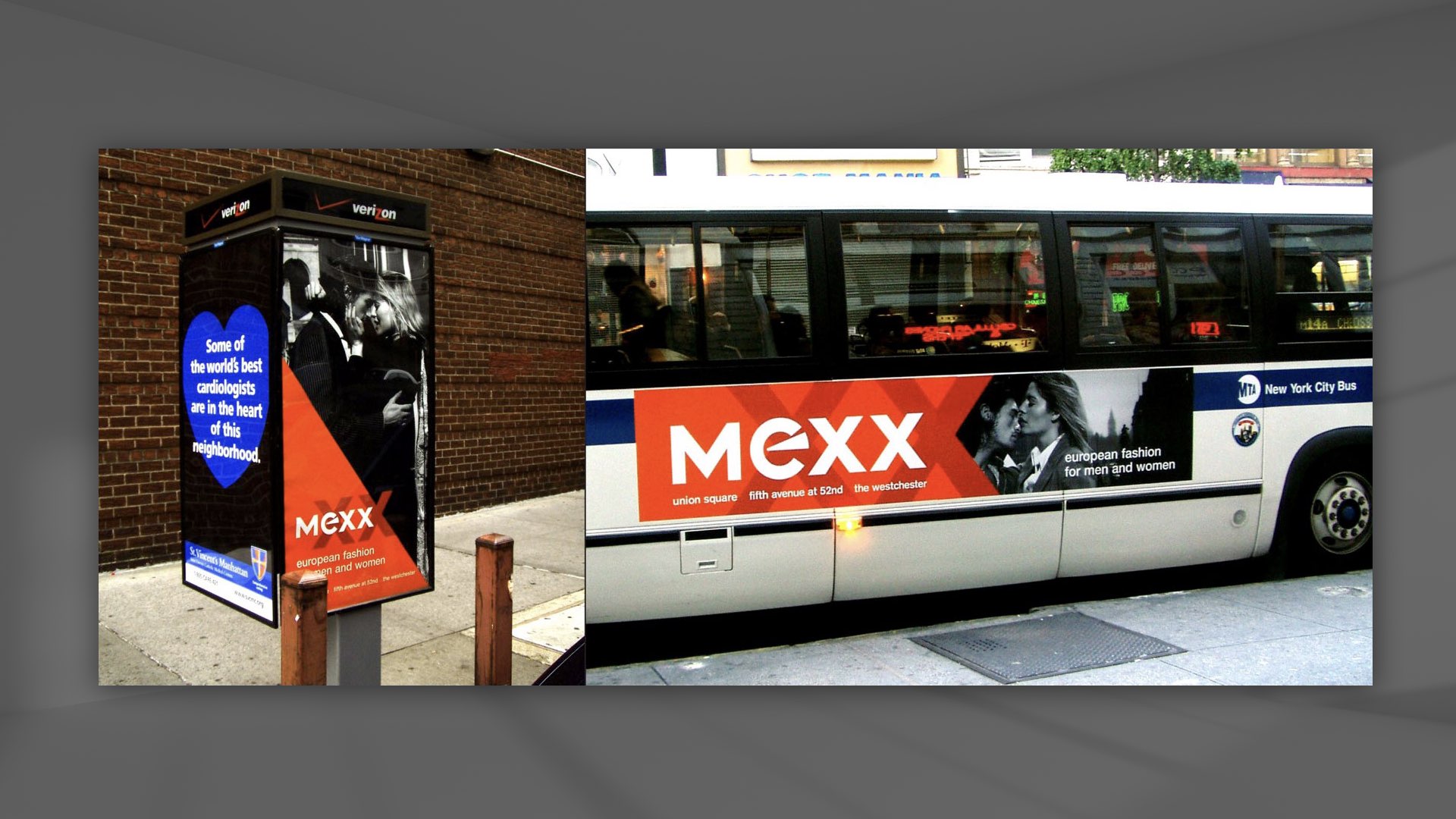
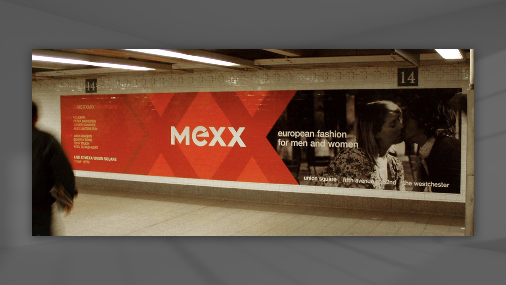
This was followed with a massive ad campaign. Here is the reworked concept, playing up the double-x kisses, and making it clear that this is European fashion.
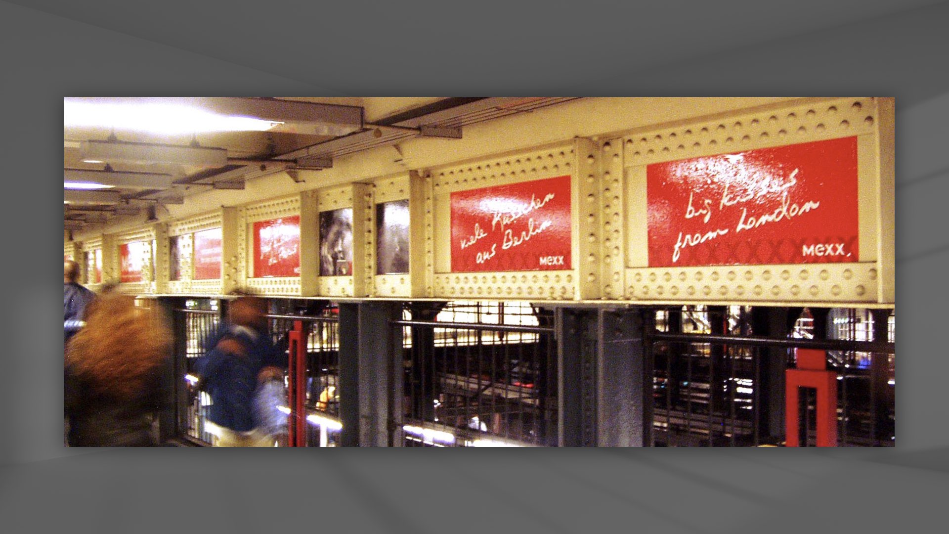
The campaign ran on buses and phone booths, on walls throughout subway stations, including kisses from European cities running through subway passages.
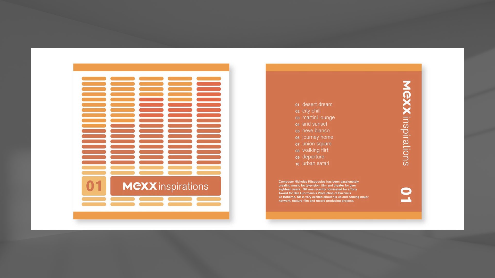
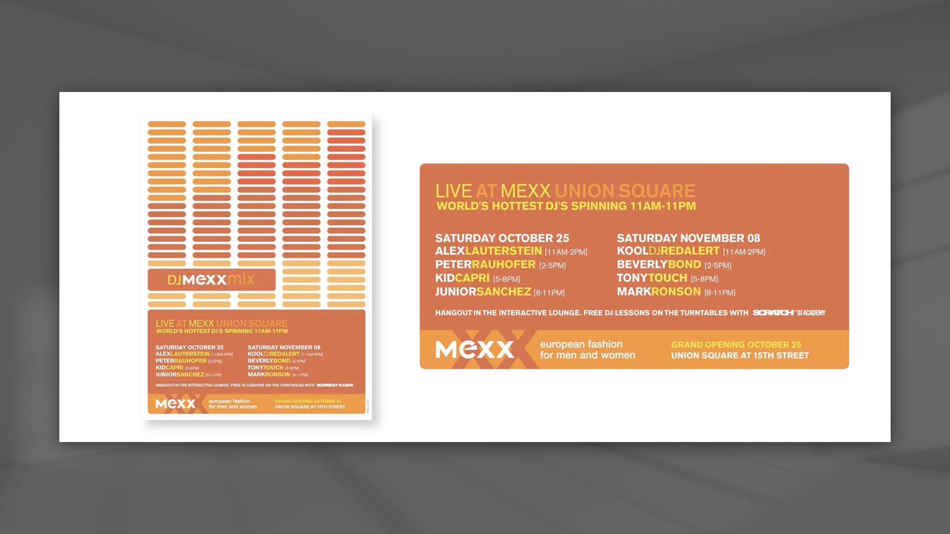
We also gave away CDs with songs written for the launch andhad live DJ events in the stores.
The launch was a huge success with packed stores for opening weekends.