Before & After
Haute and Sexy
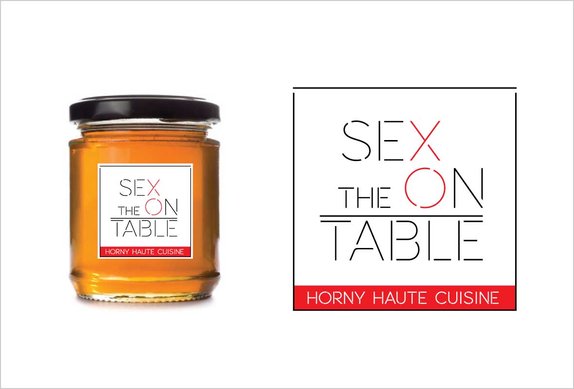
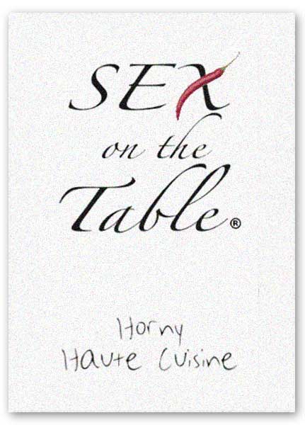
The original logo (shown here) lacked cohesiveness and was not scalable. Chef Fed needed a mark that could work in any situation and convey a solid, professional pedigree.
The biggest challenge was figuring out how to work the word “sex” into the identity without it feeling sleazy or lowbrow. This was a gourmet product line and needed to appeal to a sophisticated customer. It could be playful but had to be respectable.
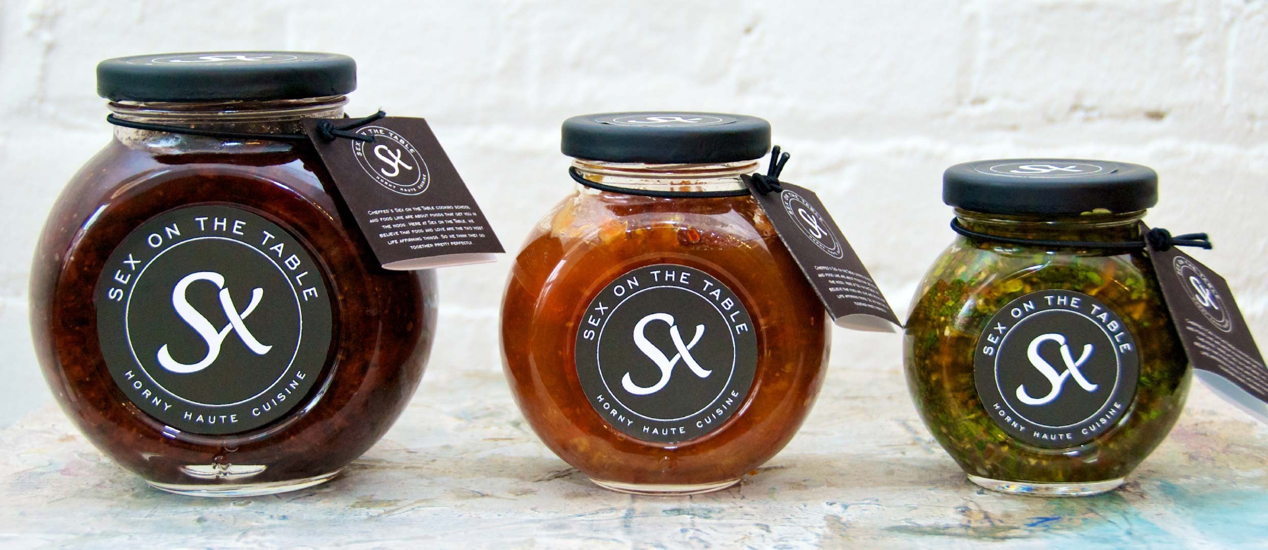
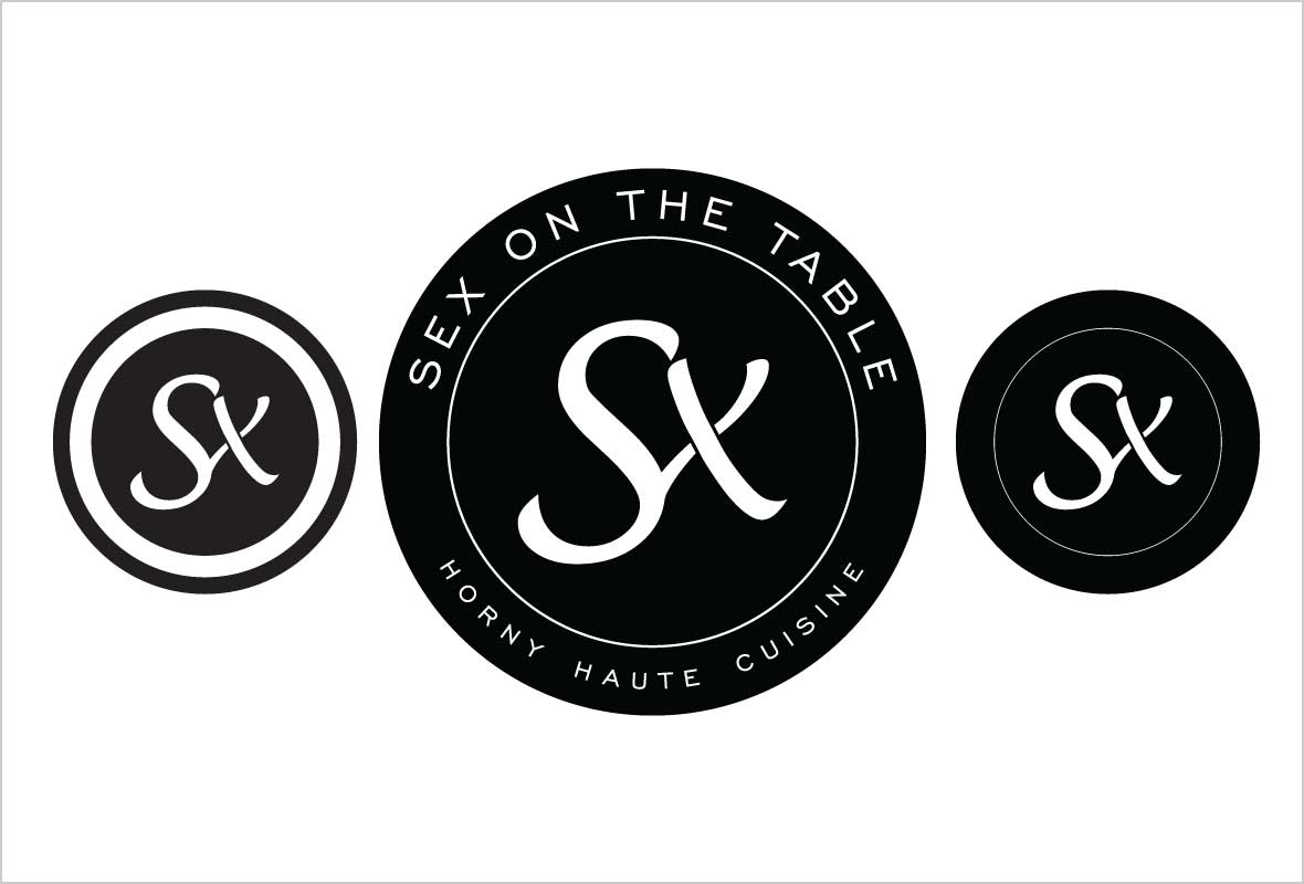
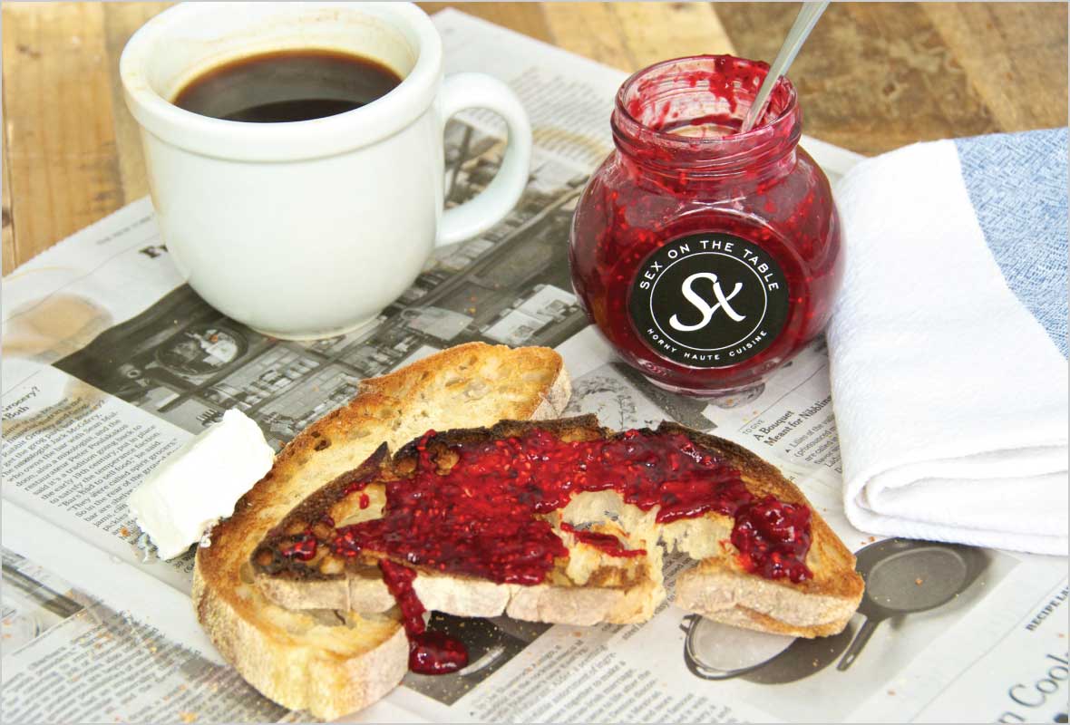
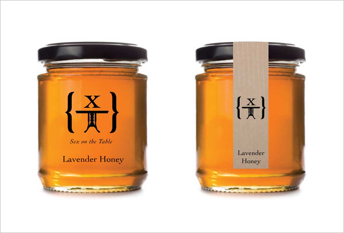
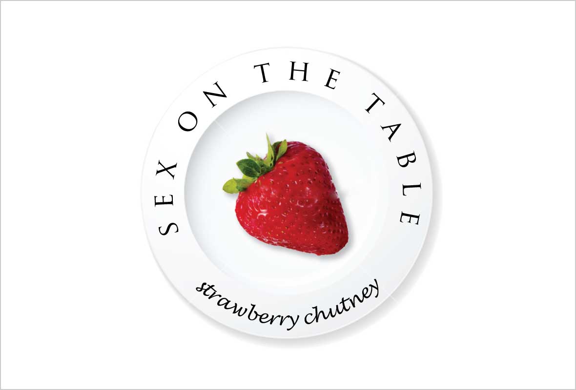
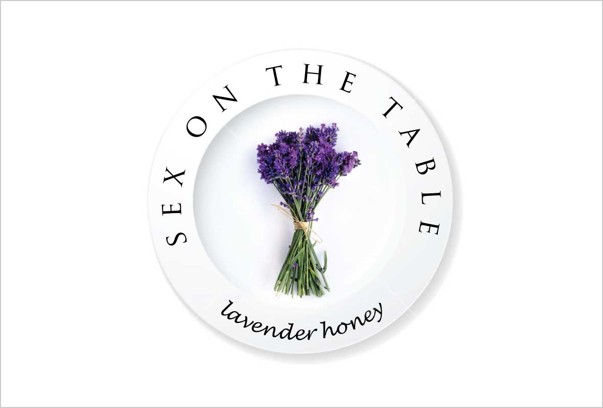
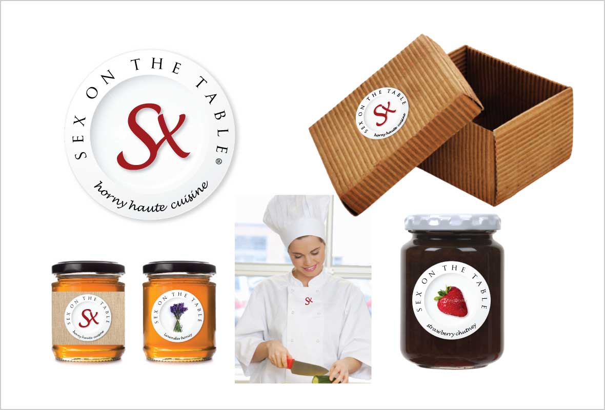
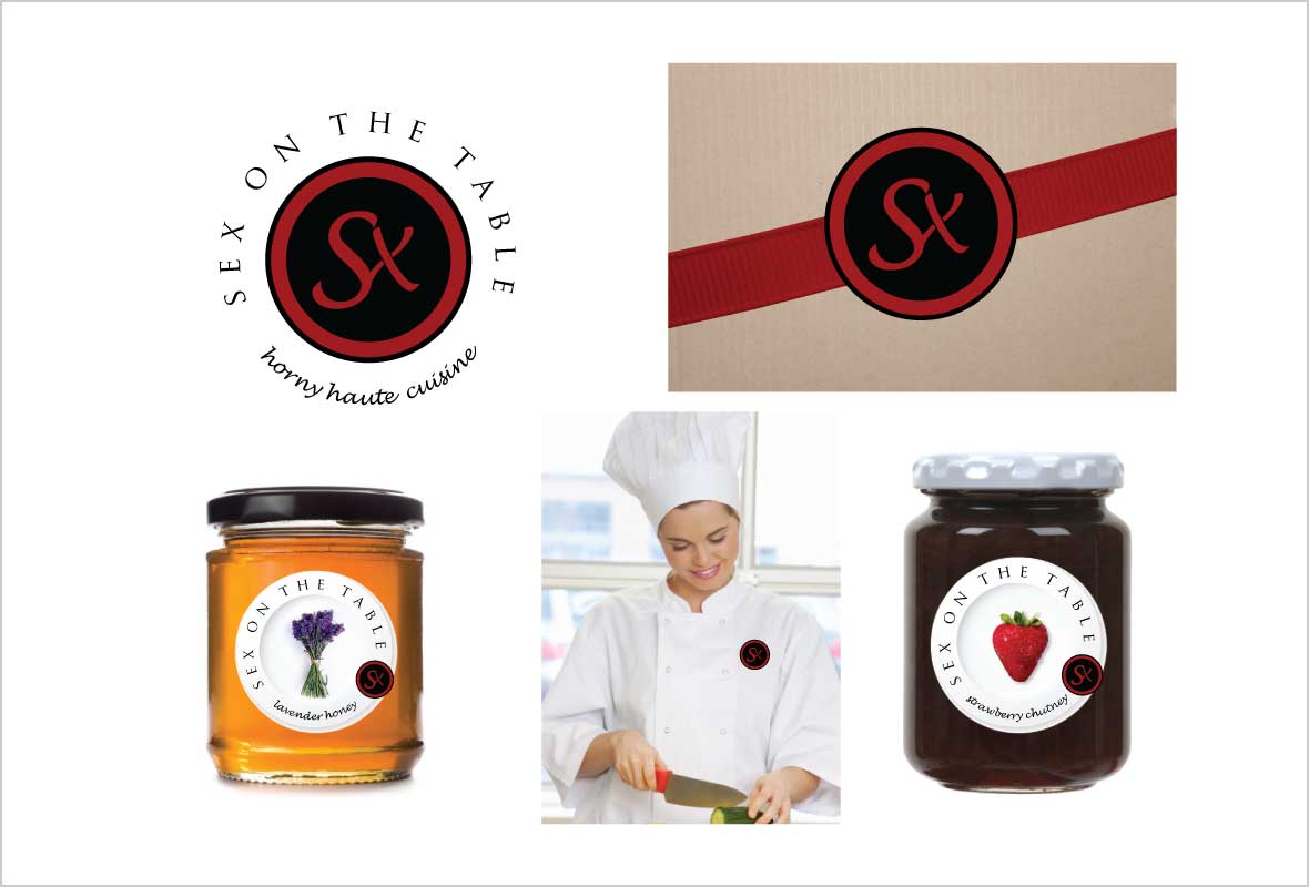
After several explorations (click on Earlier Concepts above to see the evolution) we landed on a final mark in three variations. First there is the main logo including the full “Sex on the Table” name and the tagline “Horny Haute Cuisine” in the clean, bold letters of Engravers’ Gothic. In addition there is a seal that can be used on lids or in other situations where the complete logo would be redundant. And finally there is a bold iconic version which could be stamped in wax on invitations and gift wrapping.

